纯CSS实现多彩原子动画环绕商标logo特效代码
<link rel="stylesheet" type="text/css" href="css/www.jsdaima.com.css">
</head>
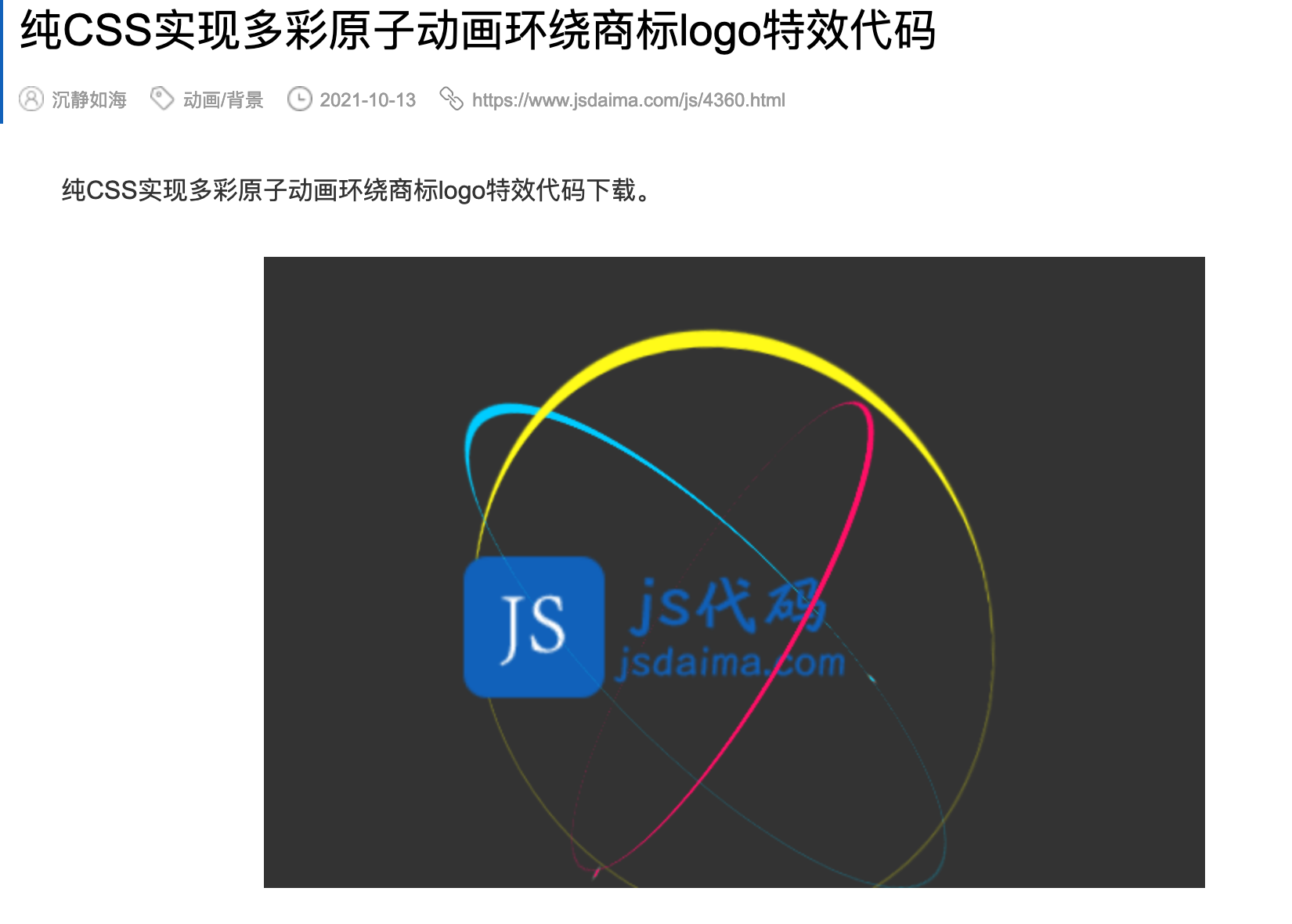
<div class="box"><a class="logo" href="#"></a>
<div class="ring ring1">
<div class="particle"></div>
</div>
<div class="ring ring2">
<div class="particle"></div>
</div>
<div class="ring ring3">
<div class="particle"></div>
</div>
</div>
body {
  background: #333;
  display: flex;
  height: 100vh;
  justify-content: center;
  align-items: center;
  perspective: 1200px;
}

.box {
  position: relative;
  transform-style: preserve-3d;
  animation: hovering 1s infinite alternate-reverse ease-in-out;
}

.logo {
  display: block;
  margin-top: 50px;
  margin-left: 50px;
  width: 300px;
  height: 300px;
  position: relative;
}
.logo:after {
  position: absolute;
  top: 0;
  left: 0;
  content: "";
  background: url("../images/logo.png") no-repeat 50% 50%;
  background-size: contain;
  width: 300px;
  height: 300px;
  margin-left: -25px;
  transform: scale(0.9);
  transition: 1000ms ease-out;
}
.logo:hover:after {
  transform: scale(1);
}

.ring {
  pointer-events: none;
  width: 400px;
  height: 400px;
  position: absolute;
  top: 0;
  left: 0;
  transform-style: preserve-3d;
}
.ring .particle {
  content: "";
  position: absolute;
  top: 0;
  left: 0;
  border: 10px solid;
  width: 400px;
  height: 400px;
  border-radius: 50%;
  border-top: 0;
  border-left: 0;
  border-bottom: 0;
  box-shadow: 0 0 1px 0px currentColor;
  transform-style: preserve-3d;
}
.ring .particle:after {
  position: absolute;
  top: 100%;
  left: 50%;
  display: block;
  content: "";
  width: 5px;
  height: 5px;
  background: currentColor;
  border-radius: 50%;
  box-shadow: 0 0 5px 0px white;
}

.ring1 {
  color: #00ccff;
  animation: rotateAnimate1 16s infinite reverse linear;
}
.ring1 .particle {
  -webkit-animation: rotateAnimate1 2s infinite linear;
          animation: rotateAnimate1 2s infinite linear;
}

.ring2 {
  color: #fffb19;
  animation: rotateAnimate1 16s infinite reverse linear;
}
.ring2 .particle {
  margin-top: 15px;
  margin-left: 15px;
  width: 370px;
  height: 370px;
  -webkit-animation: rotateAnimate2 2s infinite linear;
          animation: rotateAnimate2 2s infinite linear;
}
.ring2 .particle:after {
  top: 0%;
}

.ring3 {
  color: #ff0f66;
  animation: rotateAnimate1 16s infinite reverse linear;
}
.ring3 .particle {
  margin-top: 30px;
  margin-left: 30px;
  width: 340px;
  height: 340px;
  -webkit-animation: rotateAnimate3 2s infinite linear;
          animation: rotateAnimate3 2s infinite linear;
}

@-webkit-keyframes rotateAnimate1 {
  0% {
    transform: rotateX(45deg) rotateZ(0deg);
  }
  100% {
    transform: rotateX(45deg) rotateZ(360deg);
  }
}

@keyframes rotateAnimate1 {
  0% {
    transform: rotateX(45deg) rotateZ(0deg);
  }
  100% {
    transform: rotateX(45deg) rotateZ(360deg);
  }
}
@-webkit-keyframes rotateAnimate2 {
  0% {
    transform: rotateY(45deg) rotateX(-45deg) rotateZ(0deg);
  }
  100% {
    transform: rotateY(45deg) rotateX(-45deg) rotateZ(-360deg);
  }
}
@keyframes rotateAnimate2 {
  0% {
    transform: rotateY(45deg) rotateX(-45deg) rotateZ(0deg);
  }
  100% {
    transform: rotateY(45deg) rotateX(-45deg) rotateZ(-360deg);
  }
}
@-webkit-keyframes rotateAnimate3 {
  0% {
    transform: rotateY(-45deg) rotateX(-45deg) rotateZ(180deg);
  }
  100% {
    transform: rotateY(-45deg) rotateX(-45deg) rotateZ(540deg);
  }
}
@keyframes rotateAnimate3 {
  0% {
    transform: rotateY(-45deg) rotateX(-45deg) rotateZ(180deg);
  }
  100% {
    transform: rotateY(-45deg) rotateX(-45deg) rotateZ(540deg);
  }
}
@-webkit-keyframes hovering {
  0% {
    transform: translate3d(0, 0, 0);
  }
  100% {
    transform: translate3d(0, -10px, 0);
  }
}
@keyframes hovering {
  0% {
    transform: translate3d(0, 0, 0);
  }
  100% {
    transform: translate3d(0, -10px, 0);
  }
}
